Job hunting is one of the more frustrating things in life. It takes a lot of time and effort, a high tolerance for rejection and determination to keep pushing forward. As I navigated through the maze, I became familiar with the huge variations in the design and UX of job applications. Some are streamlined processes that take minimum effort. Others, however, are painstakingly long and cumbersome to fill, riddled with redundancies and unnecessary steps.
This experience made me look at some of the ways in which the process could be made a bit easier by tweaking how job application forms are structured and identifying elements that should be avoided. After all, designing better application processes means a better use of everyone’s time. Sometimes it feels like companies just forget about this aspect of their brand, which is odd considering that these forms can be the first point of entry for potential employees, customers or users. That’s why I believe they deserve the same level of attention as a landing page or marketing material.
At their core, job application interfaces are forms. According to Google UX Director and researcher Javier Bargas-Avila1, forms are essential in the user experience because they serve as crucial touchpoints between users and website or app owners and, as such, their design can make or break a smooth information exchange.
Designing systems for systems
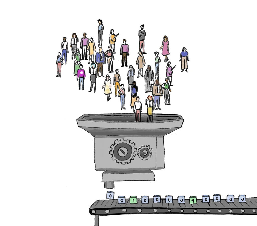
It’s understandable that application forms are designed to produce structured data. Companies, recruiters and ATS software need a way to efficiently sift through candidates, and the most straightforward way of doing is is by getting properly formatted data. And so, a system which is very good at performing a set of predefined functions is born.
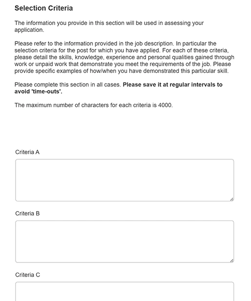
It makes sense for structured data to be part of a system—that’s why there are many form validation techniques to ensure mandatory fields are filled out or that email addresses contain the right symbols. There are also trickier examples that are all-too-common in software design and that are also present in job application forms. One of these is having to look up instructions or information elsewhere. A particular example that I encountered used the vague labels “Criteria A’, “Criteria B” and so on. The categories are just placeholders that can be reused across different types of job posts. Applicants must fill these according to a job description available somewhere else, often buried in a PDF at the bottom of the job listing, with no clear indication of where to find it.
Structured data allow for swift organisation and categorisation, but the world is a messy place and categorisation systems can quickly break down when applied to things other than convention, like the days of the week, or measurements, like height. Creating the right categories for more complex scenarios isn’t always straightforward.
Categorising is difficult
Argentinian writer Jorge Luis Borges tells the story of John Wilkins3, a 17th-century clergyman and philosopher who devised a “philosophical language” that followed a logical system of rules. It divided everything into forty categories which were then subcategorised again and again. This, he thought, would solve the inconsistency and arbitrariness of natural language. Every symbol would mean something and the world would fit neatly into his system.
Fast forward to social media’s early days, when Facebook was a small company with only ten million users, and a similar categorisation of the world was taking place. The company’s early efforts at moderation began with a single document outlining its guidelines. A fascinating Radiolab podcast episode explores the case of depictions of nudity on the platform. The document stated that nudity was prohibited, which led to protests over breastfeeding images that resulted in a set of complicated refinements, exceptions and categories. It included provisions for the acceptable age of the person being breastfed, definitions for what an infant is, and even a clarification that the exceptions applied only for pictures of humans breastfeeding other humans. Classifying the universe, after all, ain’t so easy.
The takeaway is that every categorisation system is inherently arbitrary, contradictory, and incomplete. Categories are useful until they feel inadequate, and ultimately they can be discriminatory. If this is reflected in the user experience, it’s probably not a very good one.
In this form field, a UX degree isn’t an available option for a UX Design role. Additionally, this field doesn’t allow the user to look through the full list.
This is what happened when I had to choose my degree from a long list: I couldn’t find any matches, as listing all the possible degrees is probably impossible, or very impractical at the very least. However, the mismatch between the job description and the options of the job application form was the most shocking aspect of it, considering that a UX degree wasn’t an available option for a UX design role.
(Not ) dealing with unconventional career paths
If the person filling that form studied an unconventional degree or in a newer field, chances are they’re not going to find it. With over 160 universities in the UK, the list of degrees is very long. When coupled with the fact that 26% of the total student population were international students in 2022/23, the number of possible study paths is endless.
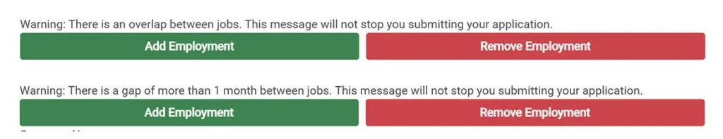
Job application forms can also prove frustrating when it comes to previous employment. Some forms only recognise full-time positions, overlooking part-time and freelance work. This is surprising given that 24% of the UK workforce was part-time and 12% was self-employed in the third quarter of 2024—not exactly edge cases. Such limitations lead to other usability problems like not being able to enter overlapping dates, or being warned about gaps in employment history.
A somewhat cynical take would be to suggest that the system is designed like this for a reason, and that both companies, recruiters and hiring managers don’t want to deal with all that mess. I think the answer is more simple than that, and that it has to do, at least partly, with these poorly designed forms. So what is there to do about it?
Better means more inclusive
Leave some answer fields open
Not everything has be left unstructured, but some fields like course names and employment history can be left open. In the book Designing UX Forms, Jessica Enders provides six criteria to determine whether to choose a closed answer field over an open one. Available answers must be appropriate, complete, mutually exclusive, self-explanatory, appropriately sorted, and unbiased. Due to the sheer number of possible job titles, type of work, and course names, it’s hard to fulfil any of these criteria. A closed answer field for this is not the right way to go from a user experience perspective.
Avoid redundancy and unnecessary steps
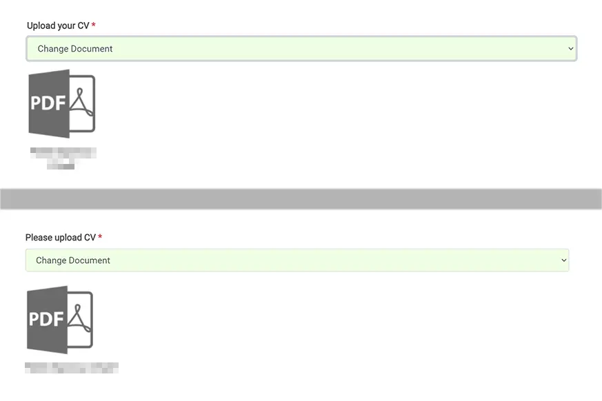
This one seems like a no-brainer, yet I was surprised at how many applications required me to retype my CV after uploading it. In a particularly ludicrous case, I had to upload my CV twice—once at the beginning and once again at the end, after retyping it in the form fields. There are smarter ways to handle this; scan the uploaded CVs, set expectations from the beginning, ask broad qualifying questions at the beginning, not at the end of the process.
Check the language used in the instructions, warning and error messages
Job hunting is already stressful enough. Having messages pop up in the form reminding candidates about gaps in their resumes, or that a past employment experiences are invalid can be disheartening. Error messages can be worded in a way that encourages verification of the information entered without making users feel like they’ve done something wrong.
Embrace diversity
A lot of this is just the old adage in UX and interaction design. Favour the human over the system. When it comes to designing a system to record someone’s life trajectory, things can feel very personal. Lengthy and poorly designed job applications can discourage candidates from giving their best when applying, and they can make companies miss out on candidates that could be a great fit just because the system is simply not designed in that way.
While there will always be an unsolvable tension between structured data and the messiness of life, I think a middle-ground that can be achieved through thoughtful designs—this is what UX is for.