CashUp
Learn how to budget and find more affordable alternatives for your purchases.
Mobile app UX Research and Design
Case study
CashUp is a mobile app that teaches people how to budget and be in better control of their spending by offering more affordable alternatives for the products and services they purchase.
My role
Design Lead
UX/UI Designer
User Researcher
Deliverables
Research Insights
High Fidelity Designs
Tools used
Figma
Adobe Firefly
Photoshop
Duration
4 months
The Problem
Many people struggle with managing their spending effectively, which can cause them anxiety and frustration. One of the main reasons for this is a lack of financial education and rises in the cost of living in many parts of the world.
The Solution
An app that helps people budget in their daily lives, notifying them in situations where they need it and offering alternatives, discounts and rewards.
Understanding the user
The research for the project was conducted based on desk research and discovery, interviews and usability testing in two phases – once with wireframes for concept testing and once with the high-fidelity prototypes.
I identified that people who most benefit from financial education through a budgeting app are young, early-career individuals, students, or people who have limited income for a period.
As the research developed, two challenges stood out:
CHALLENGE 1
Lack of knowledge
The user may want to save money but does not know where to start.
To address this, the designs aimed to look friendly and encourage the user by offering tips and fun facts about budgeting, creating a sense that the user is not alone in this.
CHALLENGE 2
Frustration
Users may feel frustrated when they don’t reach their budgeting goal, prompting them to walk away from the app
To address this challenge, a rewards system was implemented when the user stays within their budget, offering a points-based system and discounts.
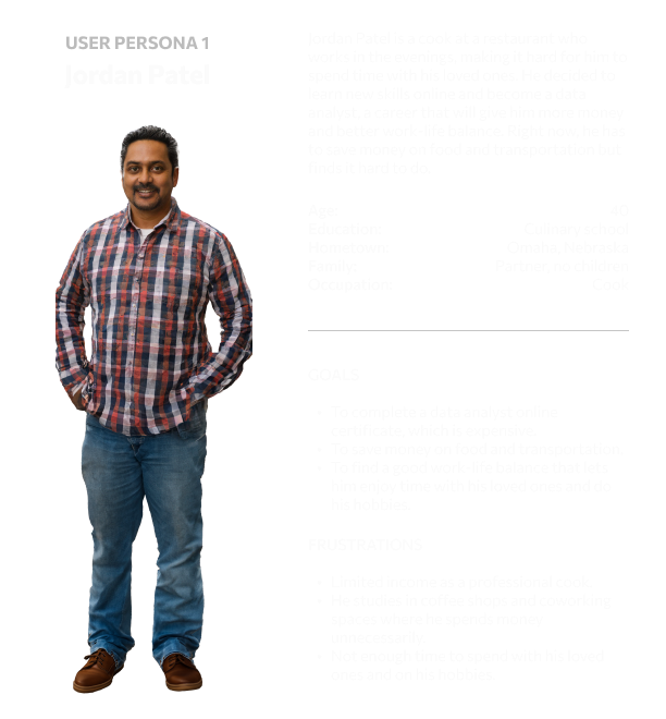
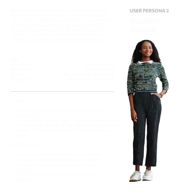
User Personas
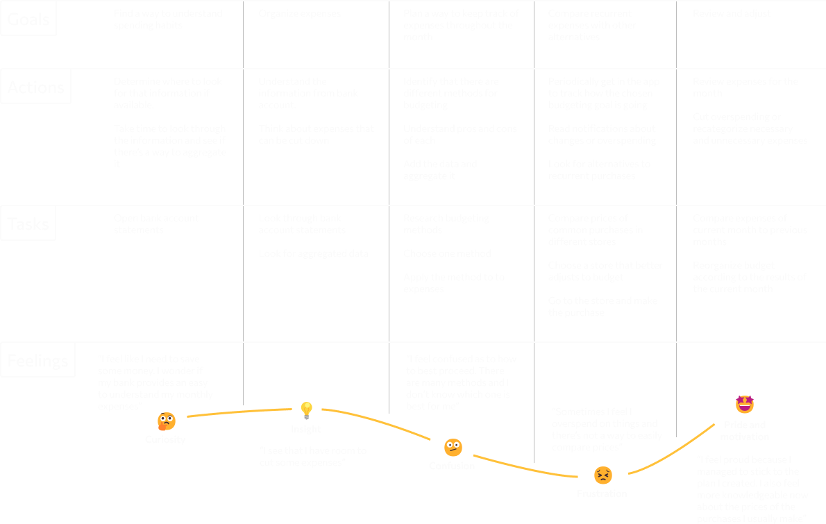
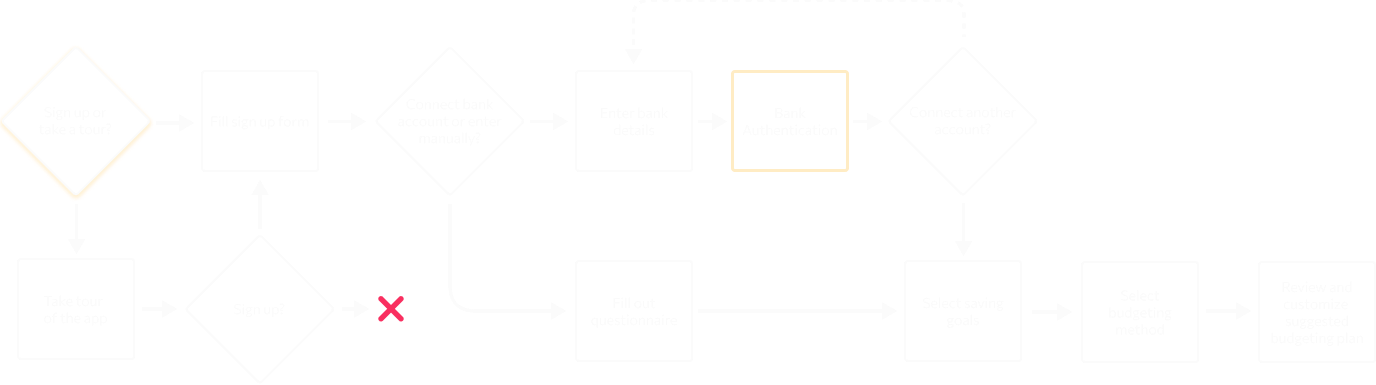
User journey
The next step was to create the main user journeys by determining user goals, actions, tasks and feelings. This was the basis to craft the main user flows and features of the app.
The design phase
With the user journey at hand, I developed a first draft of the information architecture for the app aiming for a simple and integrated interface and a seamless onboarding process.
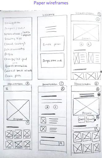
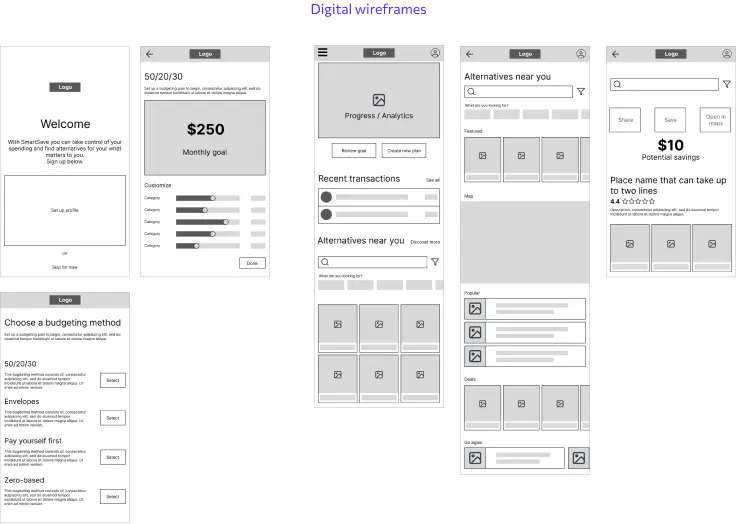
Wireframes
The next step was wireframing. I explored various design iterations for the main screen and the onboarding process. After settling on the most effective ideas, I proceeded to make the digital wireframes in Figma.
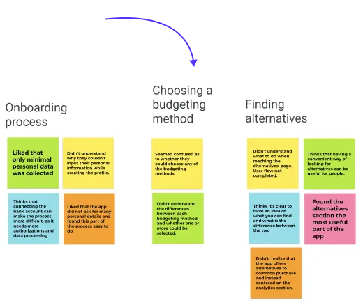
Usability study
To validate the designs, I conducted an unmoderated usability study with five participants to test the wireframes and user flows. I organized the data with an affinity diagram to uncover two key insights:
- Participants thought that the alternatives feature was really useful for their everyday spends. However, most thought they could do in-app purchases.
- In general, users were confused about budgeting methods and whether they had to choose one or more than one.
I incorporated these findings into an iteration of the wireframes to begin designing the high fidelity mockups.
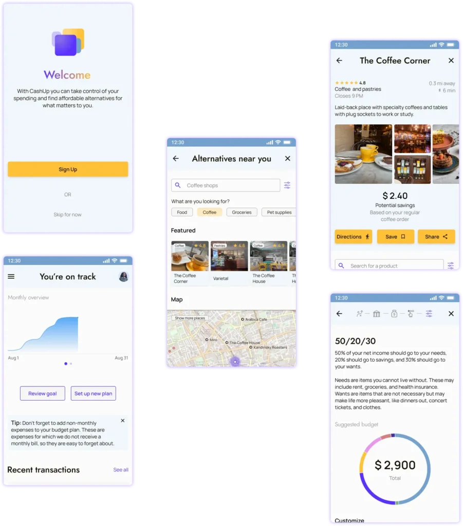
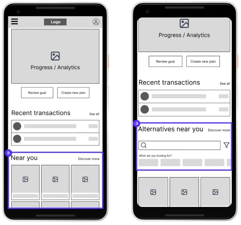
1. Changed the copy to “alternatives near you”, added a search bar and filters, and made it clear on the onboarding process that in-app purchases are not yet implemented
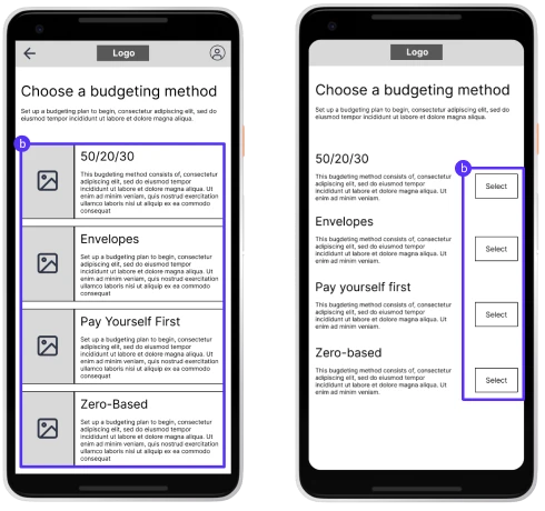
2. Added a button to select a budgeting method and made the process clearer in the copy
Accessibility considerations
Contrast
Sufficient contrast in the colour palette in accordance with the WCAG.
Text and icons
Icons accompanied with text to convey information in more than one way.
Font size
Big enough typefaces.
High fidelity mockups
Outcomes and reflection
Users must be at the center of design choices. Every step of the research and ideation phases were informed by the initial research into the topic and the following usability testing. In future projects, more in-depth interviews with a diverse set of participants would improve the outcome of the project.
Collaboration. As this was a solo project, I didn’t have many opportunities to collaborate with others. Working as part of a team would benefit the project by offering different research insights and design solutions.
Accessibility right from the start. The best way to address accessibility concerns was to integrate them right from the beginning of the process. Ensuring that a product is accessible is a sure way to attract more customers and provide a better user experience for all.